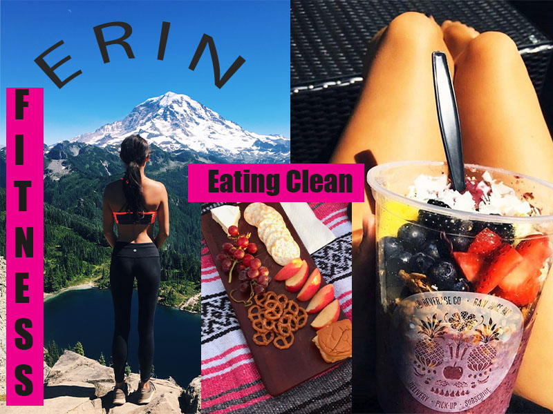
What helped inspire my design was my topic and love for eating healthy and living a healthy lifestyle. When making this collage I incorporated the labeling with the text over top and added the cute pink color to make it more fun. I want to inspire others to want to go out in the world and try new foods and be more motivated to be active. I think that knowing how to treat your body good is important because now of days many people do not think about the long-term effects. Such as, eating bad foods can have harmful effects on your mental health as well. Lots of foods have chemicals and are made with corn syrup and other added artificial things that we do not even know about. I believe if an individual does a little exercise a day and trades in soda pop for water it is good for long term effects. Because junk food can affect the brain and how you are feeling every day. If someone is eating really bad everyday they will probably feel bad every day. Also, besides working out in the gym, going on hikes and getting fresh air is good for your body, and mental health such as if one is suffering form depression and or anxiety, and a change of scenery. This is good because you are trying new things as well. Hiking is also a power cardio workout which can help your blood pressure and up the density within your bones. Living a healthy life style is crucial for leading a healthy life in the future. So, you can live longer and feel healthier. In conclusion, this is why I choose this topic because I am passionate about it and I want others to see the positive effects it can have and how you can feel better.

I really liked your project post, the message was very clear and easy to understand. The format and the editing bring a very positive vibe about your fitness and health path. It’s a very good message to give out because lots of college students are cooking or preparing meals for the first time by themselves, so they need to know the importance of eating healthy and taking care of their bodies. It also helps relieve mental stress and anxiety like you stated in your description, so it is a project that everyone could get behind. When it comes to the Photoshop skills, it looks like you did a really good job because all the pictures and wording on the post is clean cut and runs well in the color scheme. I would recommend writing your steps and how you completed the Photoshop portion in the description so the grader knows what you did to the pictures.
LikeLike
I think that the design aspect of this collage is really strong! The use of consistent colors and visually appealing pictures makes the collage fun to look at! I did notice all of the things that you wanted to convey, in your description, and I feel like your design could have done a little bit more to explain what you wanted to convey. Instead of making a collage, maybe a poster about the importance of self-care would have portrayed your ideas more clearly. I just think that without more words, the collage is just visually appealing and not informative in the way that you want it to be. Besides that, I would try to make the design a little bit more tied in. Instead of making a collage, where you just post things on top of each other, I would try to make something that mixes all of your pictures and words together a bit more smoothly. You could work on blending, cutting out the shapes of people and things in your photos, and developing a clearer message! I think by doing this your message would become clear. I think that you have a really interesting and cool topic, and I think that it is definitely something that college students should hear about (especially from their peers). Good job coming up with a topic that you are so passionate about and have so much knowledge on! Once it is integrated into your design I think it will be great!
LikeLike
Erin, it is cool to see how your theme for our class so drastically affects you, and how you will be able to reflect back on all your projects and see the progress within yourself. Also, respect for the healthy bones! I wish there was one around here. Anyway, my favorite aspect of your image collage is the contrast of the bright pink and the bright blue sky of your background. More so, all of the colors in your project pop and work well together. If I could offer some general aesthetic advice, it would be to maybe explore rearranging the photos, blending them together, and adding some text in other areas of your collage. The “Erin” and “fitness” on the left side seem to be a bit weighted, and my eyes are drawn more towards the left side again and again rather than the entire collection. Nonetheless, you have a great theme and your project is bright and simple. Keep up the good work!
LikeLike
I love this! I really like the color scheme you used, and how everything ties together throughout the entire project. I think the way that you embedded each image was really organized and well thought through. However, I think if you blended the middle picture more so it didn’t look so roughly placed, it would be an improvement to the design. You might also consider playing with the darkness and brightness of the center points of each picture to draw attention to them, like how we did in the Photoshop tutorials. I think this will emphasis the main point of your blog more! I also don’t think you should include your name on the project, because the audience already knows it’s your blog. This way, you can center your other labels on the project. Other than that, I think this project looks really well thought out and accomplishes the goal of portraying your blog’s theme.
LikeLike
Hi Erin, I like the new approach to this assignment with a collage design and your topic/theme for the project! One thing I would suggest to improve on is to try adding some more design to the picture or use a label the third picture on the right so it isn’t just two pictures labeled like maybe add another picture, but a label about fitness so you can put the two pictures of fitness together and the two with eating healthy together so its balanced. Another suggestion is you can try making the images pop out, by adding a frame around them and the background to add some design, and maybe mess with hue saturation and see if you can make the pictures a bit more colorful. One thing I see that you are strong in designing is the text design, like curving your name and the text labels.
LikeLike