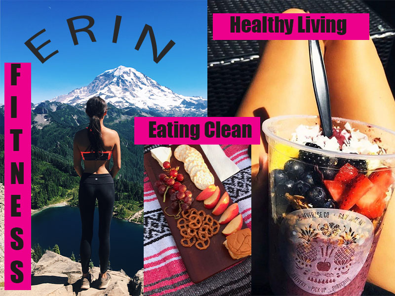
I enjoyed reading the feedback on my post and seeing what my peers thought about my graphic design. When I first made my draft, I inserted three photos that I thought went along with my overall theme of fitness and health. When I first made my draft, I decided to make it more of a collage with photos laying over one another, rather than it being to clean cute and neat! Then I took what I learned from the first Photoshop tutorial, and I added a pink colored text box and black text. Furthermore, I also added my name and used what I learned in the crumpled paper tutorial and curved my text to add dimension. I am happy with how my final draft came out. I decided to add one more text box because someone said in the feedback that it was to word heavy on the left-hand side of the design. I feel as if adding a text box on the right side balanced the whole design out and instead of everybody’s eyes going on just one side. Overall, I am really happy with how my design came out in the end. I am happy that on my feedback people understood my theme and topic easily and there was no confusion. I think that because of my photo’s vibrant colors my design caught people’s eyes. It was vibrant and happy to look at. My goal was for people to look at my graphic design and want to eat cleaner and live a healthy life style. Lastly, I believe that this expresses my fitness journey and is just a tiny portion for my life for my classmates to see.